


ETF Monkey Personal Portfolio And Asset Location Update - Q3 2022
I refer to it as "The Quarter Everything Collapsed."

Before I dive into the details I will present in this article, I’d like to share how this update will differ from previous portfolio updates, and hopefully be a lot more helpful in the process.
Combining Two Updates In One
In July, I shared with readers my portfolio update for the second quarter of 2022. But then I went a step further. Longtime readers know that I am a recent retiree. As such, the subject of asset location has become of great relevance to me. So, I wrote a two-part series of articles on the topic, as follows.
In the first article, I offered a theoretical framework for making asset location decisions. If you aren’t even sure sure what I am referencing by the term “asset location,” this is a great place to start.
In the second article, I followed up by revealing for the very first time the asset location decisions I have made in my personal portfolio.
For this update, I am going to combine all of this into one comprehensive article. Before we go any further, however, there is a key point readers need to understand. Here’s how I explained it in that second article.
Before now, I have never broken (my portfolio) out with respect to asset location. In this article, I will do so. However, to preserve at least a little privacy, I will disguise the actual amount I have in my portfolio.
Here’s how. I decided on $1 million as the amount to use for presentation purposes. I calculated the factor against which to multiply my total portfolio to arrive at an even million dollars. I then applied that factor against every component of my portfolio, such that all the relationships stayed the same.
For this update, then, I will start with that factored $1 million amount from the Q2 update, and present things on that same factored basis for this update.
Let’s get right into it then, shall we?
The Bottom Line
In my last personal portfolio update, I referred to Q2 2022 as “a quarter, and first half, that are truly ones for the books.”
In that update I shared a tweet from Charlie Bilello charting the YTD performance of the classic 60/40 portfolio. At the time, he featured that this performance was the worst in over 40 years!
As it turned out, things didn’t get a whole lot better in Q3. I have taken to referring to Q3 as “the quarter everything collapsed.” As it happens, Charlie also has a nice tweet summarizing matters through the end of Q3. Here it is.


With that background, here’s a quick look at how the major US indexes have fared, showing both the Q3 and YTD changes.

During Q3, my portfolio experienced a decline of 4.69%.
As featured in my last personal portfolio update, I am not formally reporting on the entire first half due to some unique personal circumstances that make the comparison less than ideal. However, in the interests of full transparency, for the entire first half, my portfolio declined by 16.90%.
With that, let’s get into the detail for Q3.
The Big Picture
As I have featured previously, I first summarize the detail into 8 asset classes, and then at an even higher level into 4 asset classes. This helps me see the big picture, as well as the really big picture. As an example, I can see my weightings of domestic and foreign bonds, as well as TIPs, and how they line up against my target weights. But then I can also see the weighting for bonds as a whole.
Now that I am breaking out my portfolio, not just in terms of totals, but also in terms of asset location, I apologize for the fact that this first graphic is a little “busy.” But I will try to break it down so it is understandable.
First of all, the graphic summarizes my amounts by detailed asset class, but further between my investment account (shown as “real”), my IRAs, and finally my Roth IRAs. The bottom two sections are the totals, first by the 8 asset classes, and then at an even higher level into 4 asset classes, as referred to above. In each case, I compare them against my target weights and identify differences.
Next, on the far right of the graphic, I included my weighting as of the last quarter (6/30/22 in this case) and then a computed column to display the difference. I then color-coded in green and red to visually feature which weightings increased, and which decreased.

To help you ground yourself, then, take a look at the bottom line of roughly $953K and compare it against the $1M amount in the 6/30 column. As you can quickly see, the difference is the 4.69% decline I reported in the “bottom line” section.
I will break down some decisions I made during the quarter in greater detail in the sections below. However, in terms of the very biggest picture, focus for just a second on the high-level summary at the bottom of the graphic. You will see that I got a little more conservative during the quarter, more than doubling my weighting in cash and cutting back in other areas, particularly stocks.
If you are a new reader, you might want to catch up here and here to get some idea of my thinking on this.
To close out this section, here are my detailed holdings as of 9/30/22. Again, you can see how each position has changed since my last report.

With that, let’s get into the detail in terms of asset location.
Taxable Accounts (TA)
Separately broken out, here is the portion of my portfolio in taxable accounts.

Next, the by-security detail of this portion.

In my last article, I went into great detail about my personal circumstances and the theory behind my asset location decisions.
That section concluded with an observation that, at roughly 59%, my allocation to stocks was higher than I would like it to be. In Q3, I changed that. Remember that both stocks and bonds have fallen sharply in 2022. That allowed me to take advantage of tax loss harvesting. Simply put, I was able to capture some relatively sizable short-term losses in my bond ETFs. In turn, this allowed me to sell, in a couple of cases, stock ETFs where I had some gains, and these offset each other nicely.
As a result, I ended the quarter with an allocation of only 43% in stocks. This becomes important to me as this is the money I will need to draw from first to cover my expenses in retirement. With roughly 40% of the account in cash and (reasonably) short-term bonds, I am now in better shape.
Tax-Deferred Accounts (TDA)
For our second section, here is the portion of my portfolio in tax-deferred accounts.
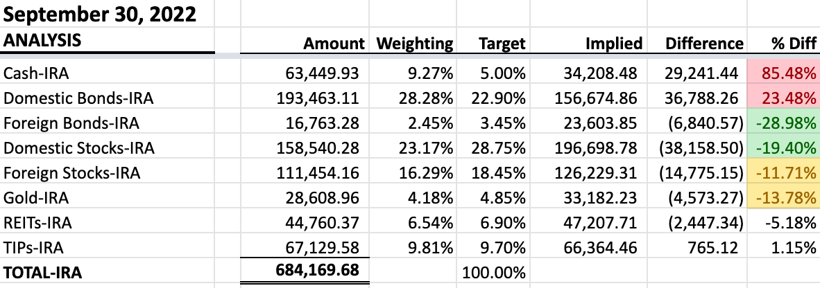
Next, the by-security detail of this portion.

Astute readers will likely note that, in this section, the detail doesn’t match the summary. As it happens, the $730,442 balance reflected in the detail is the sum of the $684,170 in TDA and $46,272 in TEA reflected in the next section. In my spreadsheet, I combine the detail because I want to be able to identify the total amount I have in each ETF, so I can accurately see its share of the whole.
As featured in the previous article, this is the second “bucket” of assets I will dip into and, if all goes according to plan, likely not for another 3-4 years.
It will likely be in this intermediate-term bucket that I make most of the weighting or rebalancing adjustments I desire to make to the portfolio. Philosophically, I don’t plan to make too many adjustments to the other two buckets.
Tax-Exempt Accounts (TEA)
This brings us to the last and, for me, the newest bucket. Here is the portion of my portfolio in tax-exempt accounts.
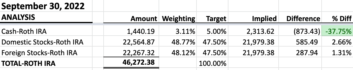
Again, in the previous asset location article, I explained the technique of strategically shifting some amount of money from one’s regular IRA into a Roth IRA (TDA to TEA). While voluntarily paying a carefully planned level of income taxes this year, I will gain significant tax advantages in the future.
Summary and Conclusion
Since this article is already quite lengthy, I’d like to leave you with just one closing thought.
Even though it is now 3 months old, the below tweet from Carl Quintanilla is still relevant. Mike Wilson of Morgan Stanley has reiterated these thoughts very recently.


As I write this the afternoon of Friday, October 7, the S&P closed out another volatile week at 3,639.66. My allocation in stocks sits right at 48%, a little lower than I would have anticipated at this level on the S&P. I have some GTC limit buy orders in that will trigger in larger increments between the current point and S&P 3,400, if we happen to get that low. If they all trigger, they will bring me to my target weight of roughly 54%.
But, we’ll talk more about that in future articles.
If you have any questions or comments, I’d love to hear from you! Simply click the button below.
Thanks for honoring me with your time by reading my work.